
Thursday, 23 April 2015
Evaluation Question 7
Looking back at your preliminary task, what do you feel you have learnt from it to the final product?

Wednesday, 22 April 2015
Evaluation Question 6
What have you learnt about technologies while constructing this product?
I used Powtoon to create a presentation on the different forms of technology that I have had to use during the production of my music magazine, I knew how to use some of the technologies but most I was completely new to and I have to ask teachers at college, people in my classes and lots of YouTube tutorials to be able to use all of the media tools effectively.
https://www.powtoon.com/show/bQmQgXJcO0s/picto/#/
Evaluation Question 5
How did you attract/address your audience?
Colour Scheme- the colour scheme I used was mainly blacks, greys and greens. This would appeal to my mainly male audience as they are typical 'boyish/skateboarder/grunge' colours. This scheme would also appeal to some girls that were into that genre of music or skating, not very 'girly' girls. Having used mainly dark I have been able to use red and yellow to attract my audiences attention. As these are also the colours for Leeds//Reading Festival it will appeal to my audience and stand out as a magazine that contains music genres that they enjoy.
Images- to attract my audience to my images I used typical grunge/skater style boys that were wearing colours such as leather jackets and beanie hats that would be worn by my target audience. I used natural settings to take my photos as my target audience tend to prefer natural locations as lots of the music videos within this music genre feature remote locations. When I took my second photo shoot using Max and Nathan in the studio I photographed them smoking and wearing lots of denim which related to my audience and artists that feature in my magazine eg. FIDLAR and Mac Demarco are renown for smoking.
Bands and Artists- I used artists from a skater/grunge/garage genre of music as my friendship group listen to these sorts of people. I decided to use my friendship group as the target audience as they would be easy to question and I already have a lot of background knowledge on their common interests. For my double page spread I featured a local artist that was trying to make it into the music industry using Indie Record labels and performing at small scale local venues such as Fruit and Adelphi. This would appeal to my target audience as 90% of them went to local, live music events every month and I know that we all are very keen on supporting Hulls music industry which is growing/strengthening rapidly.
Other interests eg. Politics and Skateboarding- A lot of the bands that I featured in my magazine are skaters as well and my audience are all interested in skateboarding whether they actually skate or not they find it interesting and it would make them look into purchasing a product. I also found that the majority of my audience is interested in Politics which is unusual for lots of young adults but it is becoming more popular as new Political Parties are being created that appeal to younger audiences such as the 'Green Party' as well as taking their manifestos online and using social media to promote their ideas and messages which enables a lot more young adults to see what their policies are.
Evaluation Question 4
Who would the audience be for your media product?
I used Prezi again to explore my target audience and I found it easier to use this time as I have gained experience on using the website.
http://prezi.com/tbbbxo259se-/?utm_campaign=share&utm_medium=copy
I also videoed my younger sisters, 12 year old girls about what they would find appealing about a music magazine and what they would want a magazine to feature.
Tuesday, 21 April 2015
Evaluation Question 3
What kind of media institution might distribute your media product and why?
IPC Media

IPC Media is one of the leading of both consumer magazine and digital publishers in the United Kingdom. It was formed in 1963 as International Publishing Company and currently produces over 60 iconic media brands, with print alone reaching almost two thirds of UK women and 42% of UK men – almost 26 million UK adults –their websites collectively reach over 14 million users every month. IPC is owned by Time Inc, the publishing company of Time Warner Inc.
The company has many sub-brands within their portfolio such as: IPC Media Connect, Market Force, Southbank, Ignite, and TX.
The iconic music magazine brand that IPC Media is well known for is New Musical Express (NME) which was first published in March 1952 and will be celebrating 50 years in the music industry in 2012. It was the very first British paper to include a singles chart. Their genre is advertised as rock which would therefore attract a wide audience of both mixed age, gender and target groups such as rockers, punks, and new age groups. The types of musicians they include are Kings of Leon, The Killers, Arcade Fire and Artic Monkeys. NME has become a truly unique multi-platform media proposition. Across the magazine, nme.com, NMETV, NME Radio and the brand's live events and awards, NME reaches over one million music fans every week. NME is the longest published and most respected music weekly in the world. Every week it gives its readers the most exciting, most authoritative coverage of the very best in contemporary music, including award winning features, the latest releases, live reviews, the definitive guide to the best new bands in its Radar section, as well as a regular look back through the magazine's 58 year heritage.
Emap
Emap specializes predominately in the ‘b2b’ (business to business) publi
 shing space. It has specific publications for each genre and in general these are quite different and contain specific content relating to an industry such as nursing, retail and media. This attracts a very wide audience which is attracted through magazines and on-line versions including rss feeds on breaking news within the industry publications.
Emap was established and founded in 1947 and has its Headquarters near Camden in London. The name Emap originates from East Midland Allied Press.
Smash Hits is Emap’s music magazine. It is primarily focused on pop music, and aimed at children and younger teenagers as its content is a mixture of very young pop musical groups, personas as well as content which isn’t of a mature nature. It was published in the United Kingdom by Emap and ran from 1978 to 2006 and was bi-weekly. It featured pop music artists, gossip and fashion that attracted young girls who liked listening to current music. Smash Hits and Top of the Pops were rival magazines trying to compete for higher market share at the same defined audience.
Summary
I would use IPC media to distribute my magazine because have a renown rock image which relates to my music more. They feature lots of older or 'throw-back' music which would create consistently as some of the artists I have used in my magazine are older. It also targets a very wide audience; potentially increasing my profits. I have aimed the product at 15-25 year olds but if older men in their 30-50's happen to come across it when looking back through older music through IPC media institutions they could be another potential market for my magazine as it should remind them of their childhood, especially if they skate boarded.
Saturday, 11 April 2015
Evaluation Question 2
How does my music magazine represents particular social groups?
My magazine is representative of 15-25 year olds, predominantly males but some more 'tom-boy' females may also be interested in this genre. I feel like this is quite a niche market as there are no many young adults that are interested in politics but skateboarders, in my experience, tend to be interested and have an opinion. I think that this is influenced by the lifestyle and music that they listen to. Especially as a large proportion is older music which talks about how the government can carry out acts that are oppressive and the need to understand what is happening in the world as well as expressing it to the younger generation in more accessible manners such as social media, music and arts. I also used the natural themed backgrounds to link the consumers to the environment which is a large part of this social groups concerns about society.
The people who will be interested in my music magazine tend to consume their music using vinyl record players, their phones (whilst skating etc) and streaming through their computers. They are not interested in radio stations or music channels on TV that play chart music that is very generic and does not contain much meaning behind it. Also, this social group is a huge sector of the people who consume music at live venues, they tend to listen to lots of local bands at small venues where you can really connect and interact with the artists.
I chose this specific social group to represent because my friendship group is made up of these young adults within society, who are skaters, have an interest in politics and the environment, music and its meaning/origin. I feel like I have good knowledge about what these people believe is right and what interests them. Also, it was useful as I can use social media to help clarify my research. For example, I asked 10 of my close friends on Facebook which political party they supported, all 10 were Green Party supporters.
Thursday, 2 April 2015
Evaluation Question 1
In what ways does your media product use, develop or challenge forms and conventions of real media products?
I made a Prezi exploring how my music magazine fitted conventions.
http://prezi.com/crhreossfwsv/?utm_campaign=share&utm_medium=copy
I made a Prezi exploring how my music magazine fitted conventions.
http://prezi.com/crhreossfwsv/?utm_campaign=share&utm_medium=copy
Wednesday, 1 April 2015
Evaluation Questions
Evaluation Questions:
1) in what ways does your media product use, develop or challenge forms and conventions of real media products?
2) how does your media product represent social groups?
3) what kind of media institution might distribute your media product and why?
4) what would the audience be for your media product?
5) how did you attract/address your audience?
6) what have you learnt about technologies while constructing this product?
7) looking back at your preliminary task, what do you feel you have learnt from it to the final product?
Saturday, 21 February 2015
Double Page Spread

Friday, 20 February 2015
Contents Page


This is my second attempt at a contents page and I am really pleased with the progress I have made. I like the layout a lot more and I think the plug that features the QR code is laid out much better. Personally, I don't like the yellow or the look of plugs on a magazine but I can tell by looking at other products such as Thrasher/Kerrang magazines that they add authenticity and add a professional finish to a product.

I don't like the changes that I have made to this contents page.
Thursday, 19 February 2015
Front Cover


This is my first front cover. I like the leaves in the background and the Barbour jacket but they don't fit in with the music theme that I have chosen. I am definitely going to use the Ghandi name and master head on the other background photos for my front cover but I think I am going to use a different font for my headings and I dont think that the plug looks very authentic, to improve this I am going to add an outline. Also, the date of issue and price do not stand out clear enough so I will have to change the colour of them because I am happy with where they are positioned on the front cover.

Progress of Double Page Spread


I am going to use this photo for my double page spread, it has a great layout for my text. I am going to use the tree to put large quotes on and the main body of the text will go in between Ben and the tree. I have wrote out all of the text I am using in it, I am just struggling to use Publisher alongside photoshop.
Friday, 6 February 2015
Photoshoot 2// America Skater 90's


I have taken some more pictures with different models. The clothing that I have picked for them is denim jackets to create a more authentic affect; the denim and black skinny jeans makes Nathan and Max look similar to the atmosphere that Mac Demarco and FIDLAR achieve in their photos for their music genre.
I could only use the white background because the weather outside was really bad but I am going to edit in a different background using photoshop.


I am going to use either one of these two pictures for my double page spread; there is a lot of room for a big heading and articles to go around the image and I am going to add a plain grungish back drop to keep the authenticity of my genre. I like the they are both featuring cigarettes and black skinny jeans with denim. Also, Max has a beard and it is very similar to those in my mood board as 2/4 members of FIDLAR have a beard so I think is becoming a fashion statement again within my genre.
Photography Shoot 1 // Nature Theme


Friday, 30 January 2015
Outfit Choices 2

Friday, 23 January 2015
A*/A/B
1. Be critical- reowrk the designs, retake photos, use photo manipulations
2. Show developement of my work, accompany with screenshots and comments
3. Frequent posts- short and snappy is better than an extended essay
4. Use a broad range of media
2. Show developement of my work, accompany with screenshots and comments
3. Frequent posts- short and snappy is better than an extended essay
4. Use a broad range of media
Saturday, 17 January 2015


Friday, 16 January 2015
Clothing choices


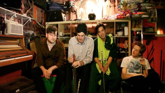
Mac Demarco is a musician in my genre and I used Jake to portray his look that is quite country based, working class Americans. Most of the bands featured in my magazine are quite skater orientated and lower class people, lots of their images show them smoking, drinking and skating in places that are unkempt and not well looked after.

Subscribe to:
Posts (Atom)